
Background
SafeSend provides a platform to automate the manual tax return process by gathering source documents, collecting e-signatures, automating payment reminders, and assembling and delivering completed tax returns.
During my tenure as a Product Designer at SafeSend Company, I had the privilege of engaging in diverse projects, each with its unique challenges and opportunities.
Time:
Team:
Skills:
Tools:
4 Months
Product Designer, Project Manager, Product Owner
Research, Design Thinking/strategy, UI Design, Icon Design, Interaction, Mockups
Figma, Adobe Creative Suite
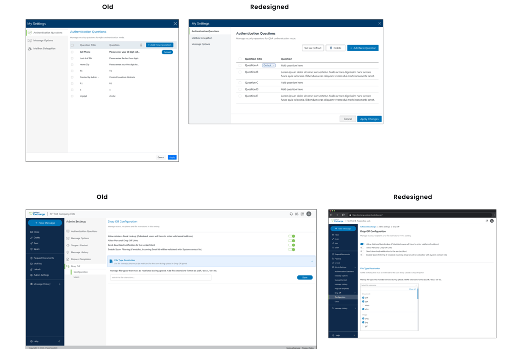
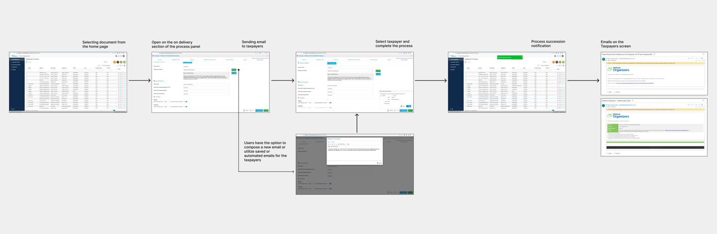
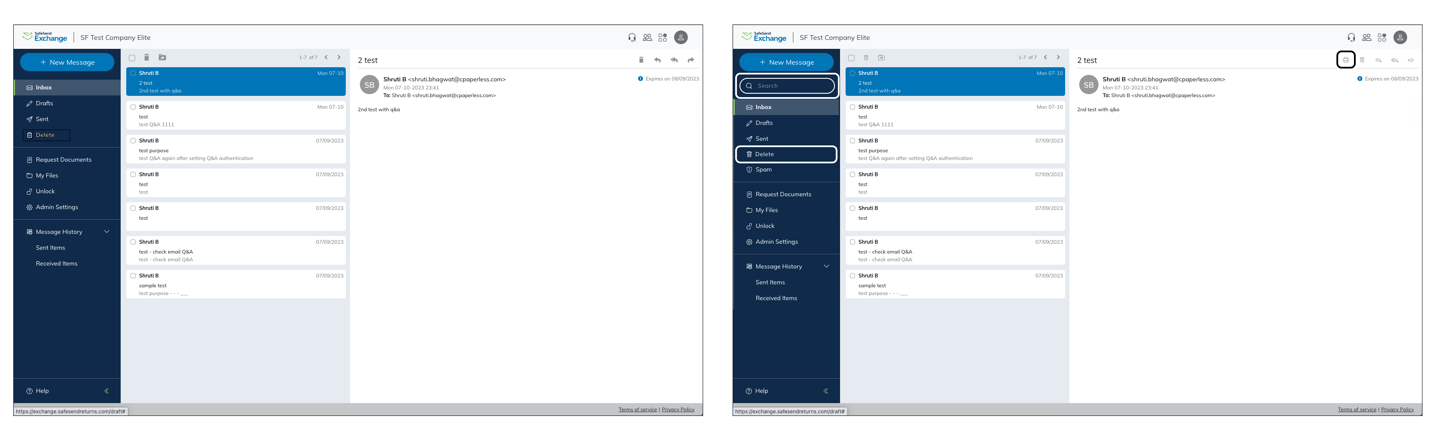
Safesend Exchange is a vital component of our product suite, offering secure file transfers for accounting firms worldwide, accessible from any device. It also allows a firm to automatically encrypt email attachments right from within Outlook.
One significant challenge we faced was that Safesend Exchange's design did not align with our brand's design system.
Product interface Redesign
Challenge
Solution
Redesign product interface to create a seamless and intuitive experience for users. This also presented an opportunity to implement valuable user feedback to improve the product experience.
I started by leveraging our established design system to incorporate elements and provide a cohesive aesthetic to align the product with the brand identity.
The process involved a thorough analysis of design interface issues, including structures of pop-up models, settings screens, tables, buttons, icons, and the sub-navigation bar. By using the brand's visual language, I designed interface options to explore feasible opportunities and presented them to the team. Their invaluable feedback and input played a crucial role in refining the designs to their best possible versions.
Process
The final designs were seamlessly handed over to the development team for implementation.
User-centric approach - Addressing user discomfort and feedback should be at the forefront of any design effort to enhance usability and overall user satisfaction.
Adaptability: I think the ability to adapt to changing requirements and feedback is equally important to improve designs.
My Takeaways
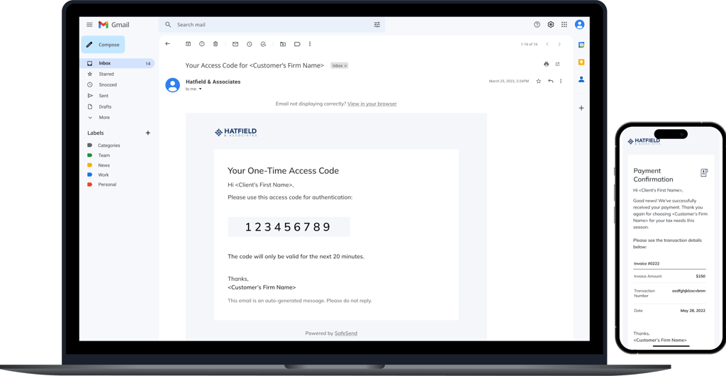
The existing email designs were outdated, lacking in clarity, and provided minimal information. Users needed emails that were precisely informative, visually appealing, and easy to navigate.
Email Template Redesign
Challenge
Solution
The primary goal was to transform the emails into aesthetically pleasing, informative, and user-friendly communication tools.
We started the redesigning process by evaluating the email workflow generation process. Users possessed the capability to compose emails based on the tax process scenario for their client. Additionally, the products generate automated emails on behalf of users. To tackle this multifaceted challenge, we focused on two pivotal elements: improving the copy of automated emails and enhancing the aesthetics of both email structures.
Process
To achieve this, we focused on several key aspects:
Aesthetics: We revamped the design to be more visually appealing, employing a modern and clean look that aligns with the brand.
Articulated Copy: We carefully crafted the copy to bring clarity and context to the messages. the aim was to provide concise yet comprehensive information.
Enhanced Elements: We strategically implemented elements to elevate security codes to easily copy and paste for users. We paid meticulous attention to detail when designing table-like layouts, making data presentation cleaner and more organized.
Accessibility: We paid meticulous attention to detail when selecting color schemes, fonts, and text spacing to improve accessibility.
Testing: Feedback from volunteer users was important in refining our designs. We incorporated their suggestions to further enhance the user experience.
The redesigned email templates are now cleaner, more visually engaging, and significantly easier to read. They have been well-received by users, with a noticeable increase in engagement and understanding.
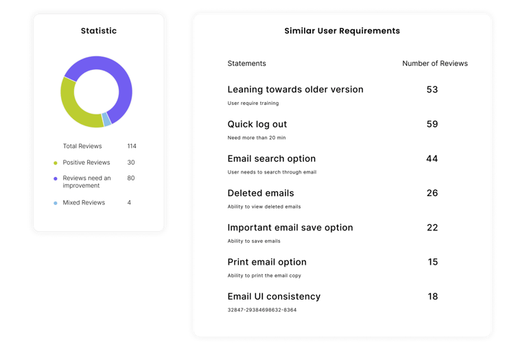
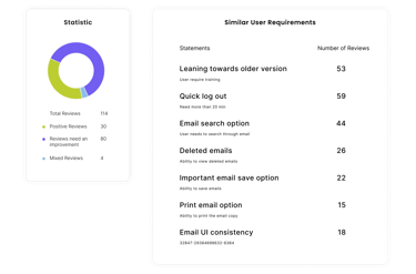
In the 2023 customer survey for the product, numerous comments were provided concerning the product's aesthetics, functionality, and user-friendliness.
Customer Survey Analysis
Challenge
Solution
The customer survey needed to analyze and extract valuable insights to translate them into improvements. The aim was to bridge the gap between user feedback and meaningful product enhancements.
I started examining survey responses to identify trends and patterns and hidden insights underneath the feedback. I followed the structured workflow according to each feedback which helped me in deeply understanding the root cause.
I created analytical statistics that guided me to set the priorities of the customer survey. To gather diverse perspectives and align on the priorities I collaborated with the team and brainstormed around the possible solutions.
process and assist in making design decisions. After multiple iterations and refinements, I delivered mockups, complete with multiple design options, to the product owner.
Process
The process of data analysis and its integration into the design is an intriguing process for me. The experience taught me how the prioritization frameworks are helpful for making strategic decisions. And by following the process I created designs that are more aligned with user needs, efficient, and more intuitive.
< Previous
Next >
Powered by ☕️ & made with ❤️ | Designed by Shruti Bhagwat © 2025