
Challenge
When it comes to finding a new job, it’s not just overwhelming but stressful too. A study found that average applicants apply to over 200 companies through 10+ job websites to land their dream job. What if I reduce their efforts by connecting them to the referrers that accelerate their job-hunting process? Currently, the Bethany website promotes six locations with their own message that may not be useful for people who want to learn more about the church as a whole.
Time:
Team:
Skills:
Tools:
10 weeks
Jayson Edwards, Project Manager
Research, Design Thinking/strategy, UI Design, Icon Design, Interaction, Mockups
Figma, Adobe Creative Suite
How might we unite these locations and make them feel more like one church with shared messages?
Identify various challenges faced by attendees when interacting with different services such as events, ministries, donations, Sunday services, etc.
Learn common success and pain points from the user's perspective.
Identify successful navigational patterns, and filter functions on website pages.
Learn how competitors use the digital space to target their audience.
Understand the needs and requirements of active, virtual attendees.
Research
Research goals
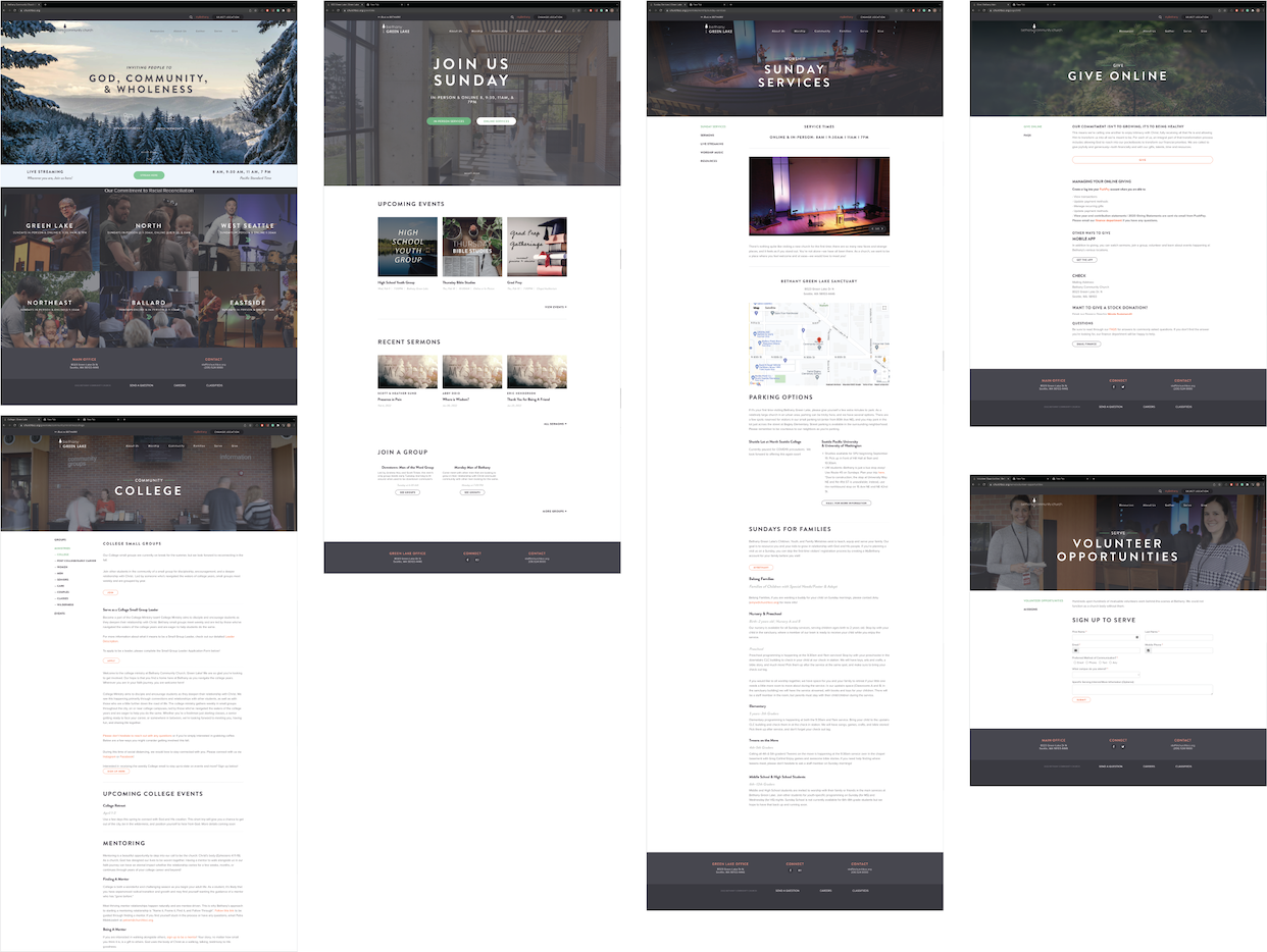
Their potential visitors will use their website to learn more about services such as what to expect, times, and locations. Current Attendees use the website for many different purposes such as being able to search for events, find volunteer opportunities and join groups. They also have access to a wide variety of online resources such as live streams, sermons, and worship music for attendees who may be remote.
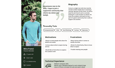
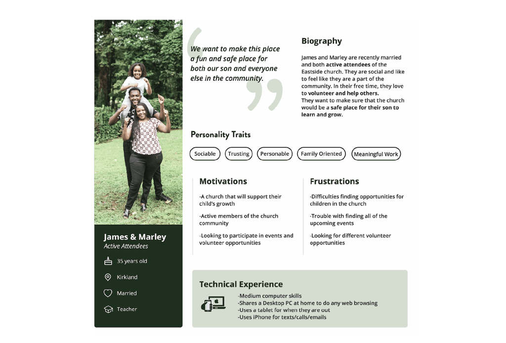
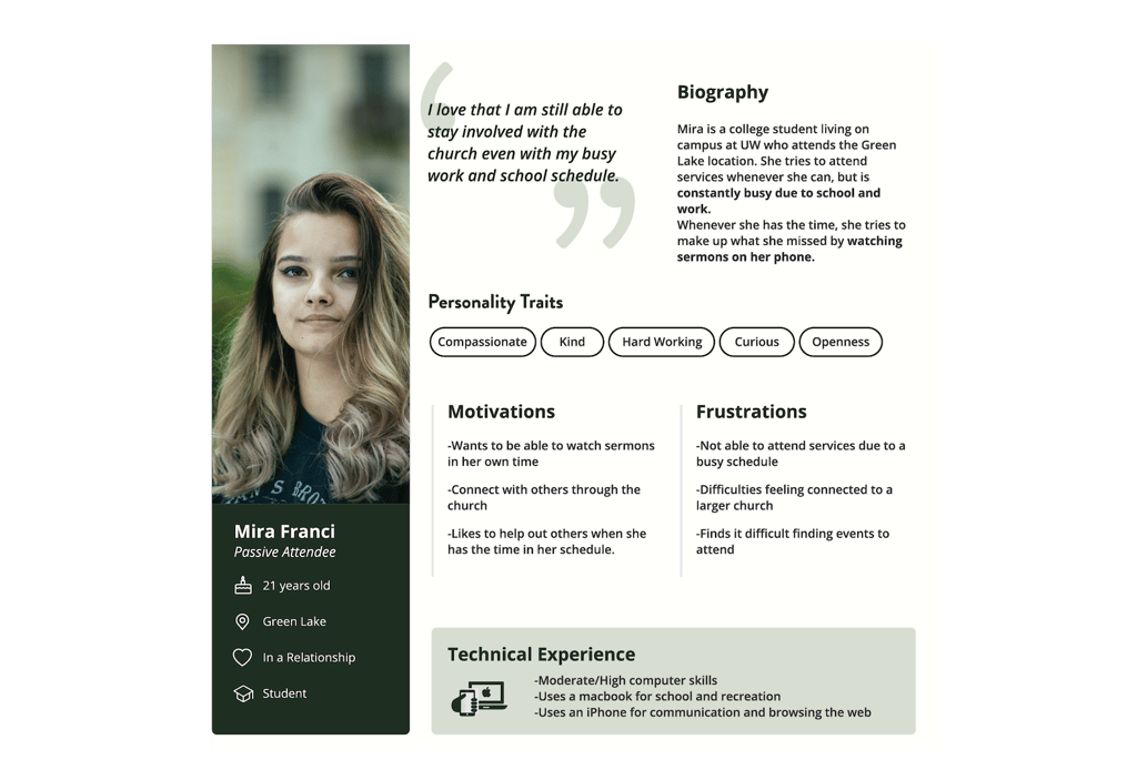
Persona
Bethany church has a unique perspective of providing fellowships and services to the community. We captured that essence from their beliefs, stories, and structures and created a clean, sophisticated, bright, and modern look.
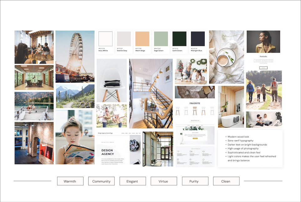
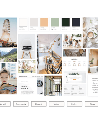
Mood Board
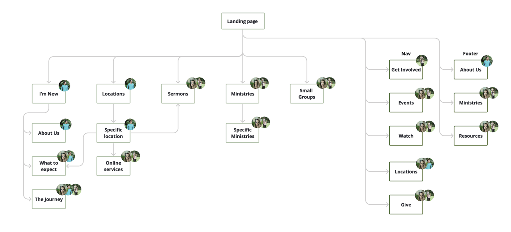
By aggregating a comprehensive list of interaction tasks, helped us to aim the highlights of the website needs to solve. We focused on each persona and their specific needs to generate sitemaps for initial wireframes.
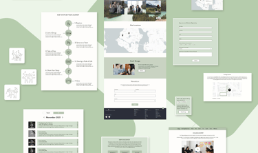
Site Map
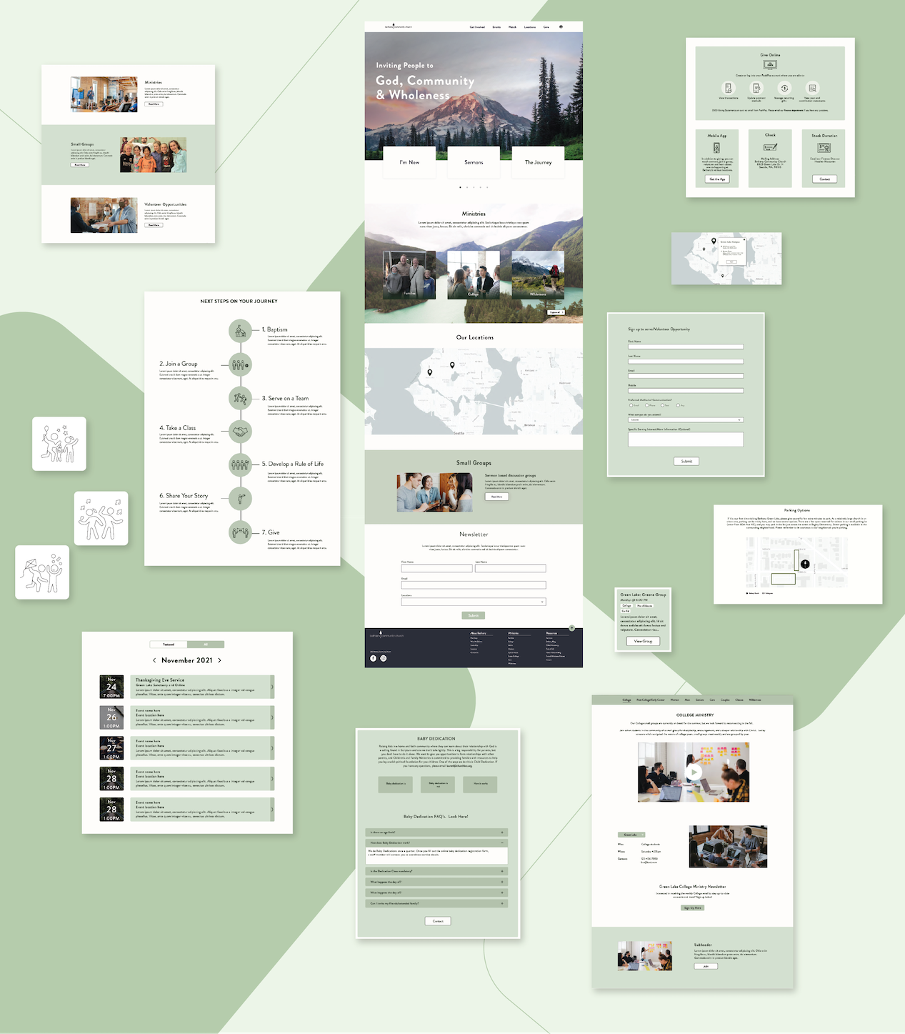
Our initial sets of wireframes helped us in analyzing users’ behavior over all aspects of the website. After many iterations and client meetings, we finalized and designed wireframes that helped users access the services that they wanted.
Wireframe
We handed over the final design, and in May 2022, the website will launch. The usability test helped us analyze whether users are better able to reach their goals, which is providing what they want on the relevant pages while reducing clicks.
Test
Working on improving an existing website had its perks and challenges. As a designer, I realized that I will not always work on a fresh or new product. Therefore, I learned how to analyze an existing product and make effective changes for the target audience.
Key learning during this project was that all UX/UI steps do not apply to every project. It was to focus on the client's individual product rather than apply a "one size fits all" system.
Conclusion
< Previous
Next >
Powered by ☕️ & made with ❤️ | Designed by Shruti Bhagwat © 2025